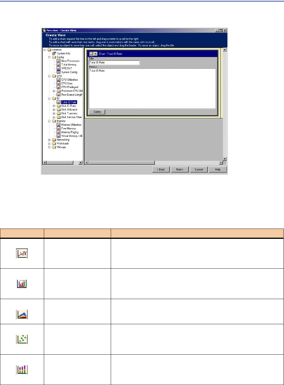
Constructing the view layout with associated metrics
108 Perceive Getting Started
Figure 43 Dragging and Resizing Charts in a Cell Grid
For graphical metrics (this includes line and multi-line metrics), you can change the
chart type within the results pane once you display the metric. To do this, click the
drop-down menu in the upper-left corner of the chart object and select the icon that
represents the chart type you want. You can select the chart types shown in the
following table:
Chart Type Icon Chart Type Description
Line
Displays values as individual points, with consecutive points
connected by a straight line, over time.
Bar
Displays values as vertical bars for the appropriate time periods
(dates or hours).
Area
Displays values in areas for the appropriate time periods.
Scatter
Displays groups of values as individual points over time. Can be
used to determine clustering of values from multiple value series.
Stacked Bar
Displays groups of values as stacked line graphs over time. The
sum of values is determined by the topmost line.