


7-4 CHAPTER 7: NETWORK PERFORMANCE MEASUREMENT TASKS
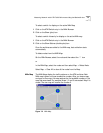
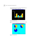
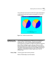
Each ATM switch is displayed as a circular icon which is also a pie chart
representing the in and out UNI traffic corresponding to that switch. The
upper 1/2 portion of the pie represents the maximum percentage of
speed of the out traffic and is colored red.The lower portion of the circle
represents the maximum percentage of speed of the in traffic and is
colored magenta.
The IP address of the switch is labeled below a switch icon.
The lines between the switch icons represents the NNI links and the traffic
load on each link is dynamically updated and is represented by a unique
color. The links are color coded according to the following legend:
0-5% White
5-10% Yellow
10-20% Green
20-40% Blue
40-100% Red
The legend information can also be viewed by selecting the Map Legend
option under the Map menu of the NNIx map.
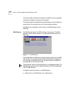
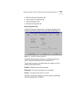
To display the node configuration:
Select the switch in the NNIx Map and then select Node Configuration.
The following static parameters of the switch are shown:
■ name
■ IP address
■ ATM address
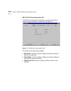
Configuring and
Customizing the NNIx
Tool
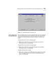
The NNIx tool has a very rich set of configuration and customization
options. To configure and customize the NNIx tool, select the
Configuration option in the Map menu of the NNIx Map.
The Configuration and Customization window contains the following
tabs.
■ Map Configuration Tab